Monday, 31 March 2014

Production Introduction


For our productions intro we decided we wanted something simple but keeping to our theme but not to extravagant. Therefore we wanted to keep it black and white with not a lot of animation like this with just a light going over some text saying the production name with black background. The light connotes a hidden and unseen fell to the introduction and relates to the thriller/horror genre.
I thought this relates to the genre of our opening as I have looked at some previous production introductions and they tend to be simple, with little animation and stick to a theme. 

Our Character

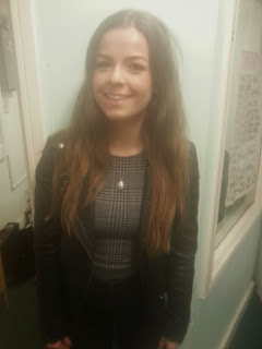
We decided to pick Emma Thomas for our main character as she was a good example of a stereotypical protagonist in a horror-thriller film. This was because she had brown long hair and a slim figure as well as being a white British teenager of 17 years old. We wanted our protagonist to look like this because we wanted it to be relatable and similar to our target audience who are of a similar and same age to our actor. This is direct address between the audience and the media, as it is creating similarities between the protagonist and the audience as if they are in this same position when they are watching this film and to make it realistic as if it could happen to them and they are in danger and give them a sense of tension and fright as it is a horror-thriller. Furthermore, by making our protagonist a female, our group thought this was traditional and common, as they are innocent and vulnerable, unlike males, as they are stereotypically shown to be strong, dominant, powerful and be able to protect themselves and others around them. Therefore we wanted to create a stereotypical role of a female protagonist that doesn't really know what is happening and just thinks everything is normal and calm, as this will make sympathy for her as she is innocent and vulnerable due to appearance, gender and class.

Friday, 28 March 2014

Progression individually and as a group

Individually, I have progressed a lot in learning new skills and techniques which I can use to achieve the best possible effects in filming and editing. I have gained more confidence in using the equipment and trying out new angles and techniques which could improve our groups work. Our continuity task helped me understand the equipment and the techniques used to create a certain shot. In the continuity task, I felt that filming was a massive development for me as i became more confident and took more control. The continuity helped the group to find individual strong points such as, who was good at research, filming and organising the group. The continuity task had a lot of problems with the original story line and the camera work which need a lot of re-shoots and developments. This then became clear to me and a member of our group that we needed to completely change the story line and the camera work needed to be developed vastly. Therefore, the two of us went away and started to film again from scratch with a new story and more camera techniques with lead to more progress and helped our group to achieve a well produced final media product. Meanwhile, the other group members gained more research and helped our group as a team move forward. During this process and the process of our horror opening, I have learnt aspects about the editing stage of production and how to use Adobe Premier Pro to cut and edit our groups footage with the help of my group member, Jordan. 
As a group I think we started slow with filming our footage for our continuity task and our title opening sequence and had a lot of problems with re-shoots due to time, setting and availability within our group. Our group had to become organised and filming became a priority within our group. Our group has progressed massively with filming and organisation. Our group has developed and we have all learnt about filming and some aspects of editing. As a group we have become more focused and serious about getting footage filmed and developing our title opening. 
Overall, as an individual and as a group, I and we have made vast developments and have learnt lots in the process of making our horror-thriller opening sequence.

Opening music


For our background music we wanted to have something which played throughout the opening that wasn't too obvious and just created a ominous and dark tone for the opening. Furthermore, we wanted a ongoing piece of background music that reflecting on our genre as a horror-thriller. After searching through many non-copyright free music sites we eventually found this piece of music that lasts just over 3 minutes. I thought this was perfect for our opening as it was exactly what we were looking for in terms of audio and genre. It had an ambiguos tone to it as well as giving the opening character rather than the silence we currently had. This music was perfect to have in the background quietly due to the monotone level and the synths to portray our horror-thriller genre. 

Final introduction


 The video above is our initial intro. We thought this was good but could be improved as we thought the wiggle/shake effect was very fake and ruined the tone of the film. However we wanted some kind of static or jumpy effect to make the text stand out more rather than just coming down and staying on screen.


Therefore we got rid of the wiggle in our second intro and instead used a blur as the text came down. Furthermore we then carried this blur on as if the text was jumping and then the text zoomed out in to the background and faded away as if it were going in to the distance. However as this was going to be at the start and the establishing shot would be after we then thought it would be better for the text to zoom back out through the 'O' again and then showing the scene. Furthermore we thought the moving blue looked unnatural.


Finally, we came to the following into and we were all happy with it as it was exactly what we wanted the text zoomed down with a blur effect and then the text stays on screen for a while to establish the title and create tension. This then zooms back out with a blur again and fades into the next scene. This was exactly what we wanted and when placed on our timeline we knew it was the perfect intro for our opening due to the tension, tone and look it gives to our opening.

Typography For Our Title


Ringbearer

I Still Know
Traveling Typewriter
Major Label


Portmanteau Regular
Cold Coffee

An Unfortunate Event

Bebas Neue

Optimus Princeps

Livia Medium

After looking at other typography in thrillers and horrors we came to the conclusion that we wanted a font with either fine, capitalised, structured serif font or bold and capitalised sans serif font. For example we either wanted a bold sans serif title with white text against plain black background with lots of negative space. Or we wanted to have a more elegant fine serif title that almost resembled the looks of a house name or door number on a house - as the title of the film is 'The House'. Therefore we want to show the references and links between he typography and what we are trying to portray. However some of the problems with some of the fonts above is some of them can tend to be too horrific and lose the thriller side of it. As the task we were originally given was a thriller genre opening to a film and not a horror genre. Therefore we are trying to get a nice mysterious title that has connotations to the two but isn't too much like a horror or a thriller.
Conclusion: Our group have looked at all the fonts above and we have made a decision on what the style of font we want the text to look like and we are agreed on the font: Optimus Princeps. This is because of the serif font and the horror effect it gives off. It also represents the lettering of a house name or a door number which relates to the title of our film.

Monday, 24 March 2014

Post-Production Realisation

When our group started to take all the shots we have and go through all of them sorting which ones are good and bad to use. After this we put the ones we deem best and place them onto our Premiere Pro timeline. However when we started to cut the shots and place them in order as well as after being edited to fit with each other in time consecutively one after the other we begun to realise that some shots were jumpy and we needed some more shots in between the current ones we have to create more tension instead of there being constant action. For example one of the first shots is a shot of the protagonist sleeping next to the fire on the sofa and then a shot of the baby's room, which then cuts to another shot of her sleeping and then the monitor starts to make noise and it then zooms in on this, but the babysitter is asleep and cannot hear this. We then wanted her to wake up shortly after by the control falling off the sofa by some supernatural or paranormal force. However we put these shots together of the monitor making noise and then the controller falling off the sofa, but we realised that this didn't look right as it cut to quickly between the two pieces of action and we needed some more mysterious shots of something else happening before the controller falls as we all thought it was too soon. However we do not quite know what to put in between these two sections of action. Therefore we now realise that everything isn't as easy as it is planned. Furthermore that when in post-production you can come across shots that don't directly fit into one another. Moreover this happens when the babysitter goes to drink the water but the arm jumps too much as she raises it up to drink. making it look unnatural. Therefore we know we have to shoot more shots and maybe shoot a variety of other things that could be used as fillers to also create mysteriousness within the opening as it is a horror/thriller which tend just to imply themes rather than actual show and consequently fit into our genre as well as making the opening more natural and flow better overall.

My conclusion: From the post production realisations our group have shot some good shots however some shots are not what we planned or didn't achieve the effect we wanted to achieve. Therefore, we need to re-shoot some of the scenes so the camera flows and the scenes look natural and flowing throughout.

Friday, 21 March 2014

Setting In Horror Openings

The Purge

This film is set on the streets of a friendly neighborhood in America. By having this thriller set around and in houses makes the film more personal to the audience as this could happen to anyone. The idea that the action in mostly set at night time makes the feeling more ominous and eery. When thinking about our horror-thriller opening we think having our setting at night will make a more tense atmosphere for the audience. The costumes in this clip seem to be just everyday clothes, by having every day clothes makes things more realistic.


The conjuring

This film is set within a family home this again makes it more personal to the audience and helps bring more emotion by involving children as children are seen a very innocent and bad things shouldn't happen to them. With the action happening inside it brings the horror into their own house so it allows the


Paranormal Activity

This film is set through cam-corders the whole time, by doing this it looks like your in the lives of the characters, as its there everyday lives being filmed by each other. Most of the film is set within in a home with paranormal activity surrounding them all the time this brings tension to the audience and fear as children are the victims within this film.


My conclusion:
From looking at my group members work I can see the typical locations of a horror movie in the opening title sequence. It also shows what the surrounding lighting, mise en scene and actual location are related with horror/thrillers. Therefore, it gives our group an understanding into what our location should be or what it should look inspired to look like.  

Our Horror/Thriller title - 'The House'

After discussions in our group, we finally all agreed on our title for our title sequence. We all agreed that the name 'The House'. This was because it was the most suitable and relatable due to the fact it is based all around and in the house. Also, throughout the title sequence it is suggesting there is a paranormal presence and feel within the house, which adds fear for the audience as it brings the horror into the home, with is considered a safe place. 
All the shots within the house are filmed in a mysterious and vague way to connote it as something that builds tension and drama with the way it is filmed and the specific props in the house. For example the mirror, fire and controller. 
We also thought that to ending of our title sequence we would place the title at the end and to close our sequence. Therefore, we all thought that the closing shot will get smaller and eventually  go through a letter 'O' in the title 'The House' aligned in the centre of the screen.

Second Shoot Evaluation

Our second shoot was a lot more successful compared to our previous first shoot. This was because we knew what our goals were as well as what we had to face. We completed a lot of the work in this shoot, getting a good quarter of the shopting done. Therefore allowing us to put this into the timeline when back in school and clip them down as well as watch them back to evaluate and see if they were good enough.
We had a lot of good shots that we could use which was lucky, however it was alsoo good as it allowed us to notice small things - like shots and mise-en-scene that we might not have noticed before. Therefore now we can add small shits in and remove mise-en-scene we do not want in the view. Furthermore we sometimes lost concerntration in our shoot which slowed us down a lot, consequently if we want to film much more and do and even better job we need to be even more focused.
On the other hand, a part from these minor mistakes we had a lot to be bappy about. As we have now set up the beginning of our opening and we're starting to see how the rest of it will look. Furthermore we have become more experienced and skilled in filming and editing the shots and we can now create better scenes as well as edited together sequences. I am extrememly happy with our geoups position at the moment. We have organised another shoot meet up in a couple of days which we hope to get even more done and add to our timeline of footage.


My conclusion: Overall our second shoot was a lot more organised, focused and successful. We had learnt from our previous shoot and the second shoot is more serious and strict. As well as the shoot going well, we still have some issues and mistakes that will need to be re-shot and edited.

Wednesday, 19 March 2014

Our first shoot evaluation

From our first shoot we realised a lot of problems with our shots and this was a big awakening for us. For example we had no shots that were useable for our actual final opening sequence and it was seen as a waste of time. However this was actually a good learning curve for us as we realised a lot of faults and things we need to change/do better next time.


For example we had terrible lighting and didn't realise this. It was extremely low key lighting and we couldn't see much of the scenery or what was actually happening.


Furthermore the lighting being like this made all of our scenes worthless and not useable which was a shame, because if it wasn't for this then  we would of been able to maybe use some of the shots.


We also realised that we had to make sure everything was set with our location. For example on our first shoot day Lauren's house was very busy and therefore other things were happening in the house which the microphone on the camera picked up. Consequently we now know that we need a completely free house for our shooting days to be successful.


We also tried to experiment with POV shots, however this was harder than we thought it would be and cause us to have a lot of un still and off balanced shots. Furthermore a few of our other shots were off balance due to a bad tripod. Therefore we now know that we need to make sure all our equipment is okay before as well as practising POV shots more.


As well as this a lot of our group kept laughing and not staying focused and this was hard as the film we need it to be completely silent and everything to happen perfectly otherwise it can ruin the entire piece. We now know that we can't laugh and make noise on camera because sometimes we might not be able to edit it out.

My conclusion: From our first shoot we had a lot of mistakes and issues that we can learn from and adjust when we shoot again. The shoot has helped us decide what works and what we think we need to develop. During the first shoot we didn't achieve the amount of work we intended to do and therefore our next shoot will consist of a lot more work and effort
Setting and props

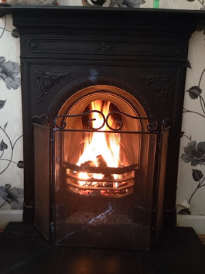
When we met up to do our first shoot we took some photographs of the specifics in the scenery and props that we will be using. This included the likes of the fireplace, mirror, baby monitor, tv control and sink tap. These were some of the specifics that we were going to focus on during the opening to present tension and make the audience focus on to draw their attention. As when we looked at other openings we notices there were always stereotypical specifics like the ones we have chosen that are emphasised in the opening to create a ambiguous and mysterious start to the film or to create confusion with the audience. These can be seen as symbols within the opening or film that are used to present something.For example the dripping of the tap could be shown to show the silence and how noticeable to dripping sound is because of how silent it is, therefore presenting tension to the audience. Furthermore the fireplace, the monitor,  tv control and the mirror all have this same effect. We wanted to present some of these specific symbols within our opening to create tension in a stereotypical way as the audience would notice this and see it as a sign of danger - like a sign.

My conclusion: The settings and props have been chosen to connote and represent meaning in our story. For example, the fireplace can represent the old fashioned style and can also connote horror in our opening. The fire creates a dark tone to the opening as the fire connotes burning and pain and maybe death. The other props help to build our story together and when used in the correct way, creates a sense of thrill and scare.


Actors Costume

When looking at costume we wanted a costume that was very typical of a modern teenager as well as something you could maybe expect within a horror-thriller film. Therefore we wanted our protagonist to be wearing something basic and plain. For example leggings, jeans, jumpers, t shirts etc. Furthermore  we also wanted casual plain colours. For example we decided we wanted some kind of white upper garment - like a white jumper or top.

The white jumper below is like the jumper our protagonist wears throughout the opening. We chose this as  jumper can seem 'home'ly' as well as it being a casual piece of wear that is communal worn by teenage girls and women of all ages in modern society. Furthermore we decided we wanted it to be a white jumper as this would represent purity and innocence because of the social connotations and general associations with the colour white. We thought the white would represent innocence and angelic like almost like an angel or a dove.


Furthermore these are the type and style of jeans that our protagonist will be wearing throughout also. We thought this was fitting as she is meant to be represented as just typical female teenager of a modern society and jeans are the most ideal, casual and normal trousers for them to wear. Therefore we also thought this was better than leggings and any pyjamas as pyjamas would show its her house whereas we want to show she is a babysitter and this isn't her own house therefore wearing clothes to go out but as if it is her own household as she is used to babysitting there. Furthermore leggings are associated with more lower class and are too casual. Moreover typical leggings are black and in some low key lighting it is then harder to see her legs and what she is doing. Therefore making us decide that navy blue jeans are the most ideal.


These white jumper and navy blue jeans are what we decided on.

 My conclusion: The costume we have chosen is stereotypical for a female teenager in todays society. As well as the costume being simple and basic it creates meaning. The white represents that the character is pure and the blue can connote she is calm and peace, as it relates to the sky and the sea. Overall, our costume has been chosen to connote ideas of our character as well as people also relating to the casual clothing.

Friday, 14 March 2014

Tile name order

  • (NAME OF THE STUDIO)
Name of the studio that is distributing the film and may or may not have produced it (Walt Disney Pictures, Columbia, Lions Gate, Universal, Marvel Studios, Dimension, Miramax etc.).
  • (NAME OF THE PRODUCTION COMPANY)
Name of the production company that actually made the film or name of the investment groups or companies that financed a substantial part of the film (usually credited as "in association with" or "A (studio name) production.").
  • (PRODUCER NAME) PRODUCTION or/and (director only) A FILM BY (DIRECTOR NAME)
Director's first credit, often "a film by XY or "a XY film".
  • STARRING
Principal actors (sometimes the stars' and director's credits will be reversed, depending on the star's deal with the studio; in other cases, as in the Rodgers and Hammerstein films, or as in all three film versions of Show Boat, or, as in many Disney films, the title of the film will be shown before the names of its actors; sometimes, as in many of Cannon's films, the name(s) of the principal actor(s) will be shown before the name(s) of the producer(s), i.e. "The Cannon Group presents X in a Golan-Globus production of a Y film").
  • (FILM'S TITLE)
Name of the film.
  • FEATURING
Featured actors.
  • CASTING or CASTING BY
Casting director.
  • MUSIC or MUSIC COMPOSED BY or ORIGINAL SCORE BY
Composer of music.
  • PRODUCTION DESIGN or PRODUCTION DESIGNER
Production designer.As a variation some of the below may be noted:
  • SET DESIGN
  • COSTUMES or COSTUMES BY or GOWNS (older movies)
  • HAIRDRESSER
  • MAKE-UP ARTIST
  • SOUND RECORDING (older movies)
  • VISUAL EFFECTS DIRECTOR or VISUAL EFFECTS BY
  • EDITOR or EDITED BY
Editor.
  • DIRECTOR OF PHOTOGRAPHY
Director of photography.
  • PRODUCER or PRODUCED BYEXECUTIVE PRODUCER
Producers, co-producers, executive producers, 'also produced by' (credited for various reasons according to contracts and personal scrutiny of the principal producer). Often, though, the name of the producer will be the next-to-last opening credit, just before the director's name is shown.
  • BASED ON THE BOOK (PLAY, GRAPHIC NOVEL etc.) BY or FROM A PLAY/BOOK BY (older movies)
If based on a book or other literary work.
  • BASED ON THE CHARACTERS BY or BASED ON THE CHARACTERS CREATED BY
If based on characters from a book or other media.
  • STORY or STORY BY
Person who wrote the story on which the script is based, gets "story by" credit, and the first screenplay credit, unless the script made substantial changes to the story.
  • WRITER(S) or WRITTEN BY
Screenplay writers. The Writers Guild of America allows only three writing credits on a feature film, although teams of two are credited as one, separated on the credits by an ampersand ("X & Y"). If each works independently on the script (the most common system), they are separated by an "and". If more than two persons worked on the screenplay, the credits may read something like "screenplay by X & Y and Z and W" X and Y worked as a team, but Z and W worked separately.
  • DIRECTOR or DIRECTED BY
Director. The Directors Guild of America usually permits a film to list only one director, even when it is known that two or more worked on it. Exceptions are made in rare cases such as a death, and subsequent replacement of the director mid-production., and for established directing teams such as the Coen brothers.
This information is sourced from Wikipedia's website.
From this research we now know that there is a specific order that we have to introduce the names within the title sequence. This will help us with our final production and post editing as we won't lose marks on not having them in the correct and typical order. However as there are only 5 of us as a team including actors we only need to include the 5 main people in the production of a film. For example We will have it in the order of:
StarringEditorProducerWriterDirector

Title Typography

Final Title Typography

We got together and discussed the ten fonts that was previously posted of the possible title typography that we might use for our title. We then settled on the following font: Optimus Princeps. The image below is an example of what our title would look like with this font:


We felt this was the ideal typography four our film opening due to it being a very traditional looking font and not sticking biasedly to one side of the genres. For example if we had a bold, sans serif capitlised font like the following of an action genre:


We wouldn't use the text above because it is a typical font of a action thriller with bold, sans serif and capitalised text. However the smoke kind of rubbed out affect on the text looks good and make it seem distorted and more of a horror. This is something we could use in our own text over the top it to give it the same effect.


Furthermore this is a science-fiction/psychological thriller that uses the same bold, sans serif, capitalised text as the Skyfall text above. Furthermore the colour red would represent danger and make it stand out more because it is an eye catching colour. This is not what we want to go for as a look as we want a more mysterious, classic and old fashioned serif font.
The reason why we wanted to choose a font such as 'Optimus Princeps' was because we had looked at previous fonts in horrors and thriller-horrors that had this similar style of old fashioned, classic styled text.

For example these are some similar horror typography fonts:


Then here are some examples of some more specific horror thriller typography fonts that are very similar to ours which we have based it on:


This is why we wanted this classic, serif, old fashioned style similar to times new roman because it is very reoccurring in horrors and thriller horrors.

My Conclusion: Overall, as a group we have decided on our font: Optimus Princeps. We all felt that this was our favourite font and the best font for our horror-thriller. We thought the other fonts didn't fit our genre due the styles and the effects.

Reflection Testing

(Group members work)

On our first shooting day before we set off with recording Matt and I decided to do some reflection testing in the mirror above the fireplace which we could incorporate as some type of shot in the storyboard of our opening. We thought that we could capture the protagonist exiting or entering the room from one of the following angles. Therefore by doing this we can also show someone else in the mirror or in the background behind her which she cannot see. As after researching into mirrors in horror films we know that they sometimes present paranormal, souls and ghosts to be trapped in mirrors or a mirrors a gateway to seeing these spirits. For example the following picture:


And this is our interpretation of a reflection shot:


My Conclusion: From the reflection testing with a group member, we have looked at the types of reflections that we could possibly use in our title opening sequence.  Some reflections we could use and worked well in some shots and angles. On the other hand, some didn't appear clearly and didn't create the effect we wanted to achieve.  

Our Setting

For our setting we wanted a slightly upper classed house hold so we could target our audience and bring the tension in the scene into the audiences houses and make it relatable by having a stereotypical household . Therefore as a group we looked at each others houses and came to the conclusion that Lauren's house was the best and almost perfect for what we wanted. This was because she had a nice spread out house with a kind of spooky surrounding to her house which can also add to the horror element of our thriller-horror. This is because her house is situated within black park and has a very open garden with trees surrounding it. Furthermore she also has other aspects of her house such as baby equipment, baby room, fireplace with mirror above and old fashioned kitchen. This was just what we were looking for. With this stereotypical slightly upper class house establishing that this family and surrounding should be safe and secure as stereo typically the rich white families in films and especially horror films are more safe than ethnic ones. On the other hand this is also stereotypical of other films with similar surroundings and allows the audience to prepare themselves for what the film is about in this opening scene with the use of any establishing shots. I think this surrounding and location is typical of the type of film we are trying to create and therefore reflects on what we want as well as create the scenes and tone that we are aiming for.


Story Board and shot list

Shot list


This is our shot list for our opening title sequence. The shot list guides and helps us  when we start filming. After we have done the basics of our shot list we were then able to explore and develop by trying a various amounts of different angles for the same shot to see which one we think fits the best.

Our story board also guides us as we have an idea of what our title opening to look like. This also helps  when we come expand and adjust on the shots, when we start to film.


Story Board